How the VIMM Model can Improve Usability of Your Site or Application
There are many definitions of “usability,” but most of them are too general to be useful. The VIMM Model is different. It’s a practical approach to improving usability that can be applied by just about anyone.
(And before I get too far here, I would love to credit the model’s creator, but I don’t have a name. It’s a concept I was introduced to by Human Factors International when I was studying to be a Certified Usability Analyst. If you can provide attribution, please leave a comment!)
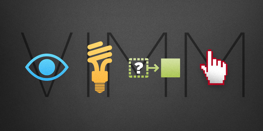
What is the VIMM Model?
VIMM describes the four ways we make users think too much and work too hard. The usability goal of VIMM is to “reduce load” in four key areas:
- Visual Load
- Intellectual Load
- Memory Load
- Motor Load
Here’s how it works.
Visual Load
To reduce visual load, avoid the following:
- Too much clutter on the page
- Long content that isn’t “chunked” with adequate spacing
- Poor vertical alignment (People scan a web page vertically, so give them a clear, well-aligned vertical path.)
- Busy backgrounds that serve no purpose
- Too many calls-to-action
- Harsh colors and fonts
- Dark backgrounds with small and/or difficult to see fonts
Example of heavy Visual Load (Sorry, PC World!)

Intellectual Load
This is where we make them think too much. Avoid these common pitfalls and your users will thank you:
- Inconsistent site structure and navigation
- Missing navigational way-finders like page/section labels
- Objects with poor visual affordance (Is that a button or a tab? Is that thing clickable? What does that icon mean?)
- “Catchy” labels and naming that users don’t get
- Content (graphics/copy) that lacks context
- Poor instructions due to bad copywriting
- Lack of system feedback
- Controls that don’t function as they were designed to function
Example of Confusing Controls
Looks like a checkbox, but functions as a radio button. This is the career search form on a major retailer’s website. I feel like someone is just messing with me here to be original. (In fact, I wrote an article two years ago on the usability of this very form. Should I be hurt that they still haven’t read it?)
Looks like a checkbox, but functions as a radio button. This is the career search form on a major retailer’s website. I feel like someone is just messing with me here to be original. (In fact, I wrote an article two years ago on the usability of this very form. Should I be hurt that they still haven’t read it?)

Memory Load
What did you have for breakfast? Studies show that our short-term memory is pretty pathetic. If your site or application is not intuitive and you are counting on the user to remember something, plan to be disappointed.
The good news is there are ways to reduce memory load:
- If you have to require a login, provide an easy way to retrieve usernames and passwords
- Don’t make the user memorize workflows; instead make them obvious
- In task driven processes, keep all relevant information visible or easily accessible
- Always make it painfully obvious where the user is in the site hierarchy and/or within a task or workflow
Motor Load
This refers to physical movements that are too difficult or too frequent and degrade the user experience.
Avoid fatiguing your users with:
- Excessive clicking and typing
- Excessive device switching (Forms are the typical offenders here: mouse for the drop-down, keyboard for the text field, back to mouse for a radio button, back to keyboard for another text entry, no tab index. Carpal tunnel, anyone?)
- Long distances to very small targets, like small icons or calls-to-action
- Requiring very precise hover positions to activate menus and buttons (Is it just me, or does this one drive you crazy too?)
By applying the VIMM Model to your website or application, you can reduce the load on the user and vastly improve the overall user experience. As a humble user myself, I thank you! And so will your clients and customers.